
Call Us (855) 374-7216
Printing intricate designs onto fabric can be both an art and a science. For professionals and enthusiasts in the world of printing, direct-to-film (DTF) technology has revolutionized how complex graphics come to life on various materials.
With its ability to handle fine details, vibrant colors, and diverse textures, DTF opens a world of creative possibilities. This guide will explore advanced DTF design techniques, offering tips and tricks to help you elevate your prints and achieve stunning results, no matter how complex the design may be.
Creating a visually striking DTF print begins with a well-prepared design in your preferred graphic software, such as Adobe Illustrator or Photoshop. Starting with clarity and precision ensures that the final result will meet your expectations and showcase even the smallest details.
Whenever possible, opt for vector formats such as .AI, .EPS, or.SVG to maintain scalability and ensure that your design retains its sharpness and quality regardless of size adjustments. However, if you’re working with raster images such as .PNG or .JPEG, set the resolution to at least 300 DPI. This will maintain crisp, clear details in your design, particularly for intricate graphics and small text elements that demand precision.
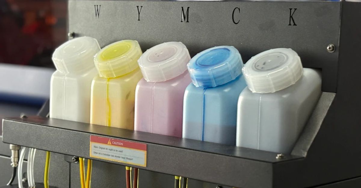
Effective color management is the backbone of achieving vibrant and accurate prints. To guarantee precision, start by calibrating your monitor. This ensures that the colors you see on your screen closely match the final output. Additionally, employ ICC profiles tailored to your specific DTF printer and inks. These profiles are essential for mapping colors accurately and avoiding costly mistakes during production.
Use ICC profiles to create consistency across your workflow and eliminate guesswork when translating digital designs to printable formats. Before committing to full-scale printing, test small swatches of your design. This step allows you to verify that the colors align with your expectations and the final print is accurate.

With the right configuration, you can bring intricate color details to life, seamlessly blend gradient fades, and customize white underbase settings to enhance your design’s depth and vibrancy. Advanced RIP software often includes tools such as choke settings, which are essential for improving edge precision.
These settings can adjust the overlap between the colors and the white underbase, preventing potential misalignments and ensuring clean, crisp edges. Take the time to explore your RIP software’s full feature set. Experiment with settings such as gradient control, layer management, and color trapping. By mastering these options, you'll be well-equipped to handle demanding designs with confidence and precision.
High-resolution files are the backbone of successful complex graphics. To preserve intricate details and achieve the best possible output, avoid using low-resolution images. Blurry or pixelated designs can detract from the professionalism of your work and compromise the final product's visual impact.
Aside from using high-resolution images, make sure to scale your print to its intended print size before exporting your work. This prevents the stretching or distortion of graphics and ensures that every detail translates beautifully onto the film. Additionally, work with lossless file formats such as TIFF or PNG when saving your designs. These formats maintain image quality by preserving all the details without introducing compression artifacts, setting the stage for precise and vibrant prints.
When working on advanced designs, mastering layering techniques is essential to achieve clarity and precision in your artwork. For multi-layer designs, ensure proper separation of colors and intricate details to prevent overlaps or visual muddling. This not only enhances the overall appearance of your design but also ensures smoother printing transitions.
Use your design software to meticulously separate colors and elements. Assign each component to a distinct layer, such as backgrounds, foregrounds, and intricate features, to ensure superior control and visibility during the editing process.
Label and organize each layer within your software for easier navigation. Group related elements together for quick adjustments and to maintain consistency. This approach enables seamless edits and helps achieve striking results, even in the most complex designs.

A critical element in creating vibrant and detailed designs for dark or colored fabrics is the proper placement of a white underbase. This layer acts as a foundation that helps the colors in your design stand out, ensuring they remain bold and vivid against any background. Neglecting this step can result in dull, washed-out prints that fail to meet quality standards.
Take the time to establish a precise white underbase for every element of your design that requires it. This is especially important for dark or highly saturated fabrics where the printed colors need extra support to maintain their impact.
Configure your RIP software to carefully adjust the white underlayer placement, ensuring it’s only applied where necessary to prevent common issues such as ghosting, uneven tones, or excessive ink buildup. Fine-tuning these settings not only enhances the clarity and brightness of your designs but also optimizes ink usage, saving time and resources while delivering professional-grade results.
Curing the DTF transfer film efficiently is critical to ensuring the durability and vibrancy of your designs. To achieve professional results, heat the adhesive evenly across the film at the recommended temperature and time—typically 160°C to 180°C for 10-15 seconds. Uneven curing can lead to issues such as peeling or reduced adhesion over time, which can compromise the longevity of your work.
Use a high-quality heat press to maintain consistent pressure and heat distribution during the curing process. Regularly monitor and calibrate your equipment to ensure optimal performance and eliminate the chances of uneven results. Proper curing is a vital step that anchors your design's resilience and appeal, making it stand up to wear and washing for longer.
Excessive ink can lead to a host of issues, including smudging, uneven transfers, and a lack of detail in your finished design. Overloading with ink not only affects the print's appearance but can also compromise its durability and adhesion. To achieve professional-quality results, fine-tune your techniques.
Calibrate your ink flow settings to strike the perfect balance between coverage and precision. Always test your setup using sample prints before moving to the final design. This allows you to ensure ink application is thorough yet controlled, preventing oversaturation while maintaining vibrancy and detail in your graphics.
Mastering these advanced DTF design techniques is a skill that grows with practice and a touch of ingenuity, one complex project at a time. By understanding the intricacies of this innovative technology and applying the tips outlined in this guide, you can push the boundaries of what’s possible with your designs.
Fortunately, whether you’re crafting bold, vibrant prints or intricate, detailed graphics, Inkjet Parts is your partner in creativity. With everything from DTF film printers to parts and accessories, we have the equipment and expertise to help you bring your designs to life.
In addition to providing top-of-the-line printing equipment, Inkjet Parts also offers a variety of inks, films, and other supplies to help you achieve the perfect print every time. With a commitment to quality and customer satisfaction, Inkjet Parts is dedicated to helping you elevate your printing game.


Leave a comment